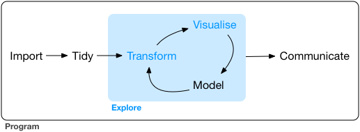
Exploratory data analysis
What is exploratory data analysis (EDA)?
There are no routine statistical questions, only questionable statistical routines. — Sir David Cox
EDA is an iterative process:
- Generate questions about your data
- Search for answers by visualising, transforming, and modelling data
Use what you learn to refine your questions or generate new ones.
![]()
Asking questions
Your goal during EDA is to develop an understanding of your data.
EDA is fundamentally a creative process. And like most creative processes, the key to asking quality questions is to generate a large quantity of questions.
Two types of questions will always be useful for making discoveries within your data:
- What type of variation occurs within my variables?
- What type of covariation occurs between my variables?
Some comments about EDA:
- It is not a formal process with a strict set of rules.
- Explore many ideas: some will pan out, others will be dead ends.
- Even if questions are predefined, quality of data still needs to be assessed
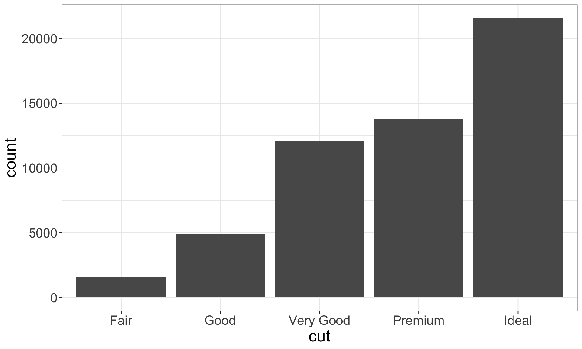
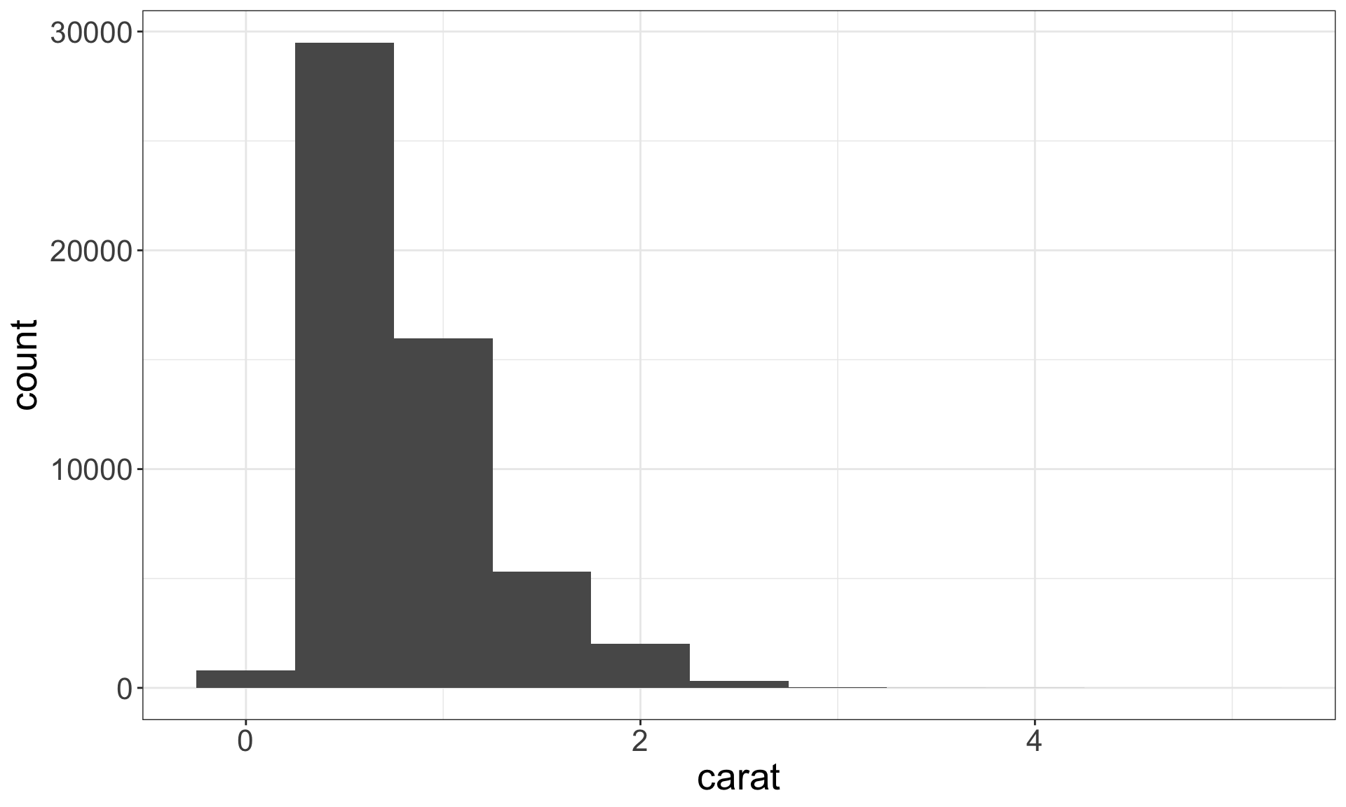
Variation
Variation is the tendency of the values of a variable to change from measurement to measurement. Every variable has its own pattern of variation, which can reveal interesting information.
Recall the diamonds dataset. Use a bar chart, to examine the distribution of a categorical variable, and a histogram that of a continuous one.
ggplot(data = diamonds) +
  geom_bar(mapping = aes(x = cut))
ggplot(data = diamonds) +
  geom_histogram(mapping = aes(x = carat), binwidth = 0.5)
Identifying typical values
- Which values are the most common? Why?
- Which values are rare? Why? Does that match your expectations?
- Can you see any unusual patterns? What might explain them?
diamonds %>% filter(carat < 3) %>%
  ggplot(aes(x = carat)) + geom_histogram(binwidth = 0.01)
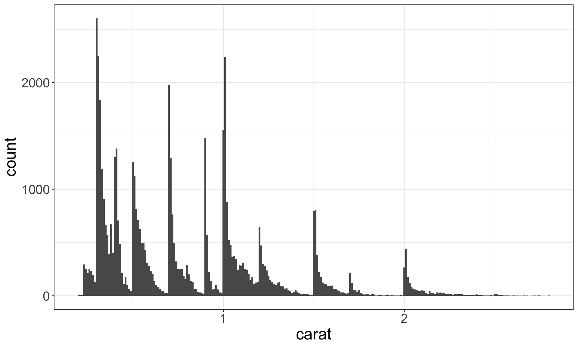
Look for anything unexpected!
Identify outliers
Outliers are observations that are unusual – data points that don’t seem to fit the general pattern.
Sometimes outliers are data entry errors; other times outliers suggest important new science.
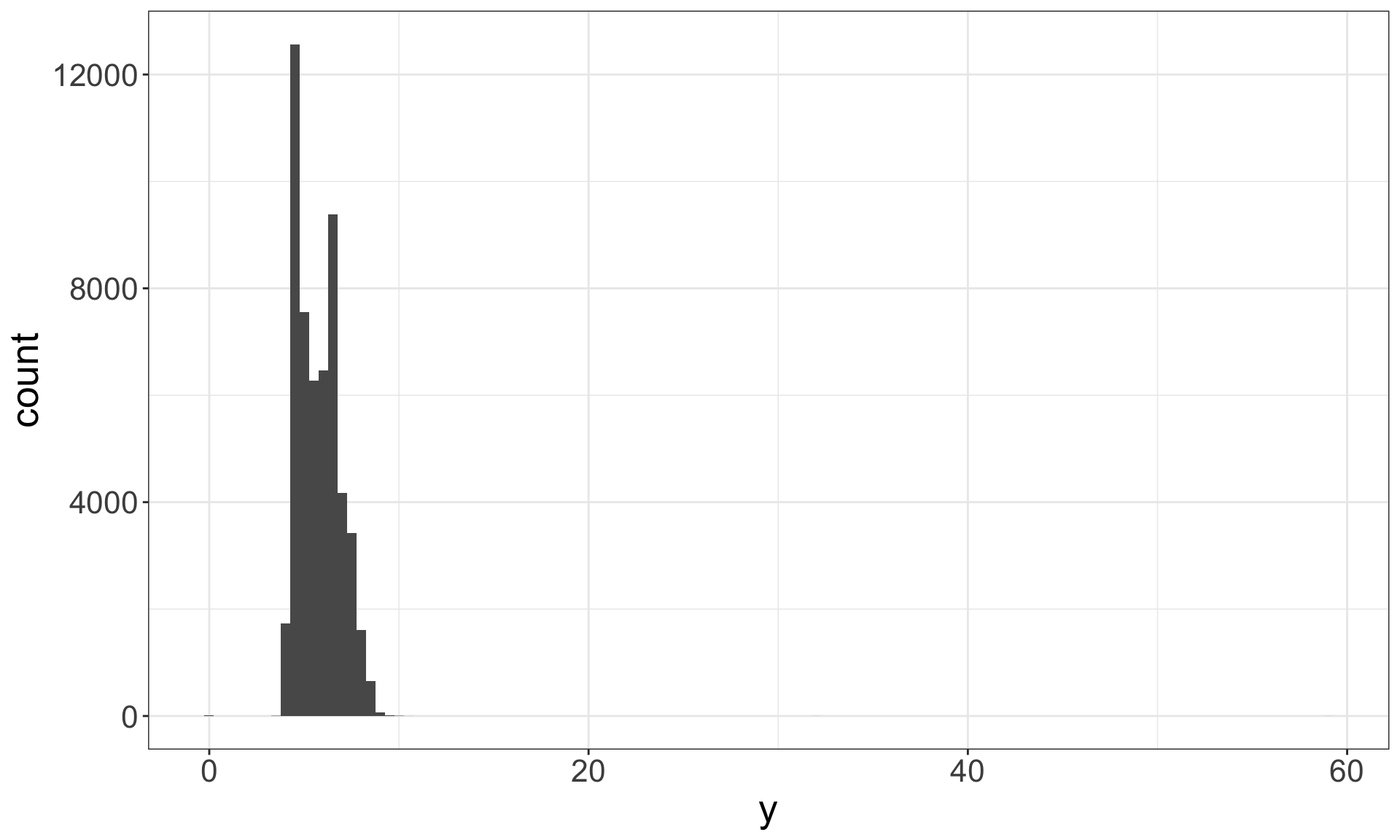
ggplot(diamonds) +
  geom_histogram(mapping = aes(x = y), binwidth = 0.5)
ggplot(diamonds) +
  geom_histogram(mapping = aes(x = y), binwidth = 0.5) +
  coord_cartesian(ylim = c(0, 50))
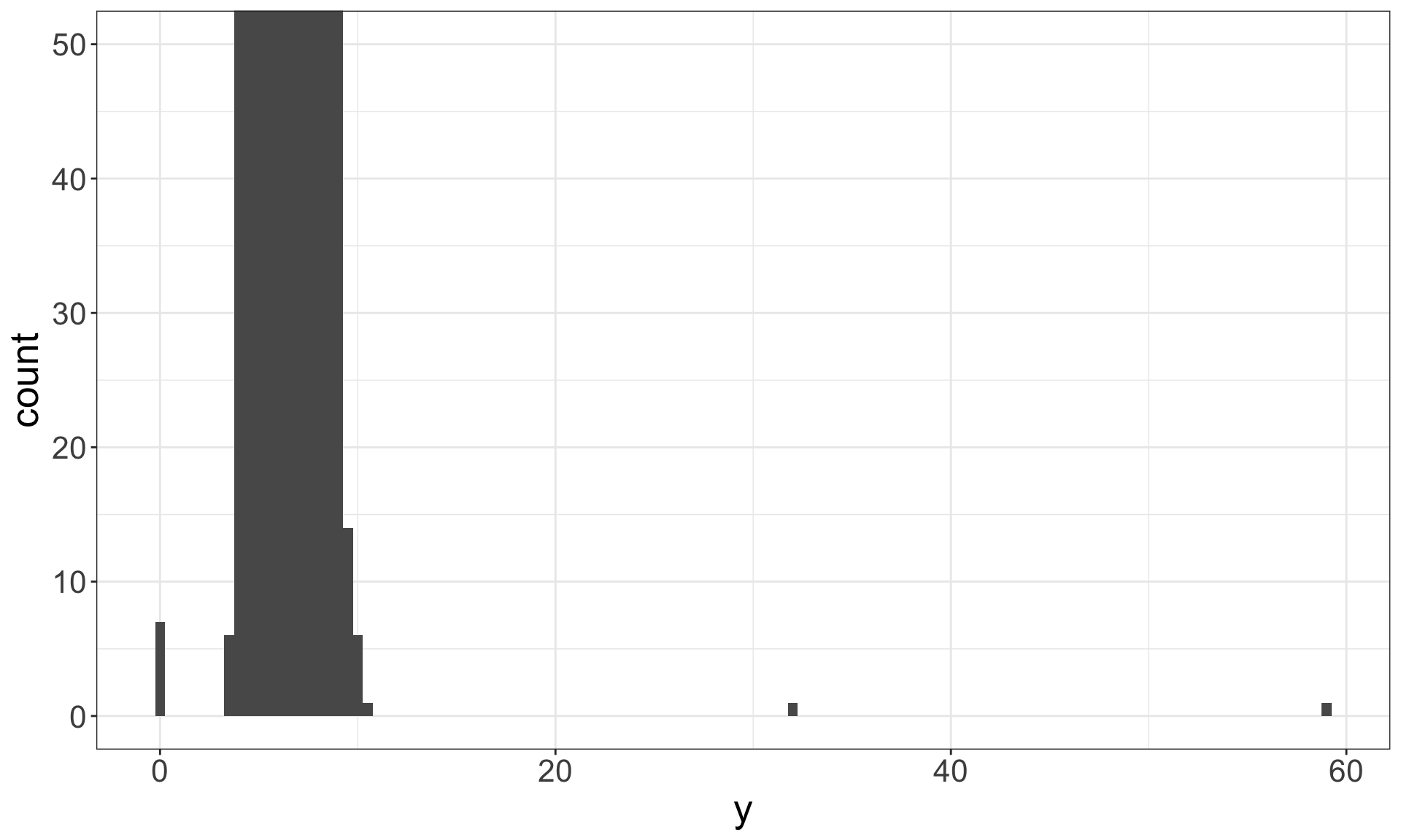
Identifying outliers
Now that we have seen the usual values, we can try to understand them.
diamonds %>% filter(y < 3 | y > 20) %>%
  select(price, carat, x, y, z) %>% arrange(y)
## # A tibble: 9 x 5
##   price carat     x     y     z
##   <int> <dbl> <dbl> <dbl> <dbl>
## 1  5139  1     0      0    0
## 2  6381  1.14  0      0    0
## 3 12800  1.56  0      0    0
## 4 15686  1.2   0      0    0
## 5 18034  2.25  0      0    0
## 6  2130  0.71  0      0    0
## 7  2130  0.71  0      0    0
## 8  2075  0.51  5.15  31.8  5.12
## 9 12210  2     8.09  58.9  8.06
The y variable measures the length (in mm) of one of the three dimensions of a diamond.
Therefore, these must be entry errors! Why?
It’s good practice to repeat your analysis with and without the outliers.
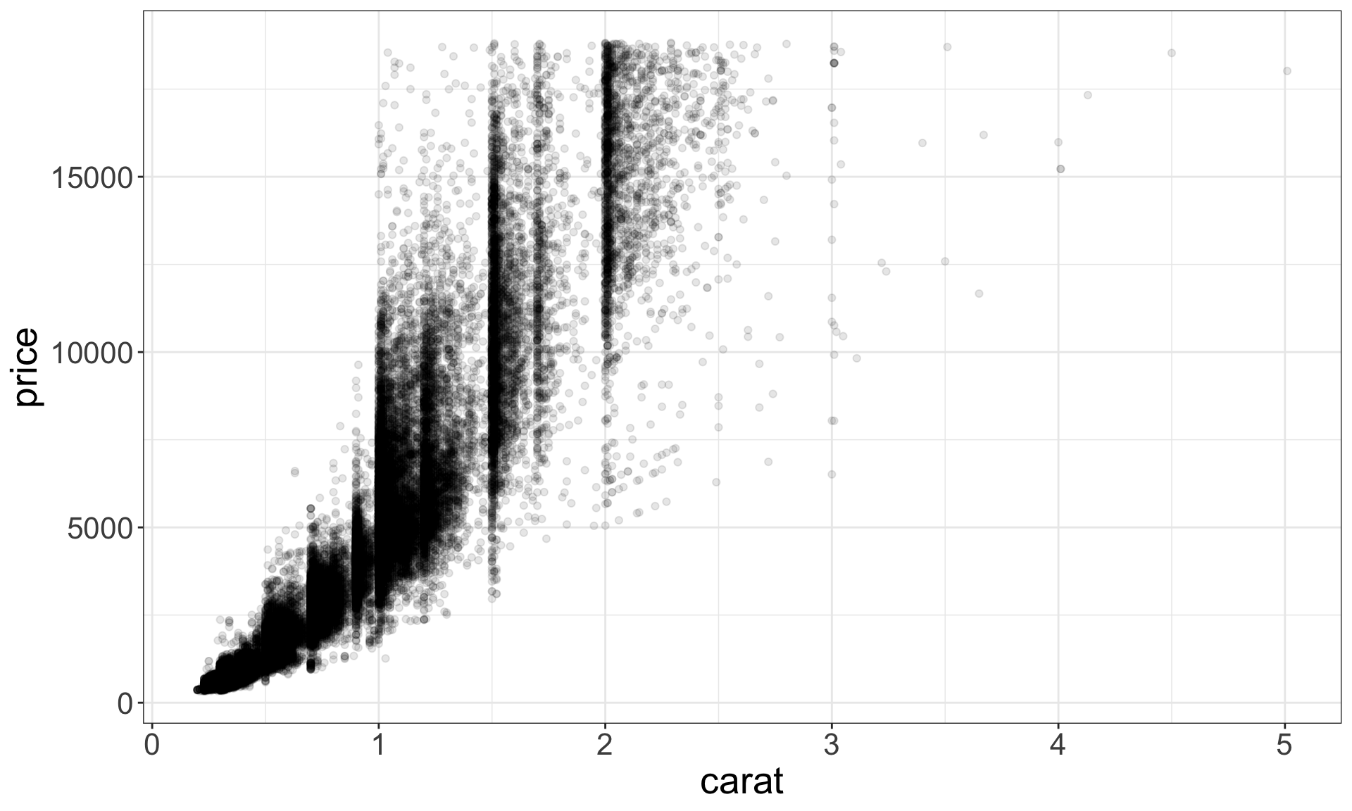
Covariation
Covariation is the tendency for the values of two or more variables to vary together in a related way.
ggplot(data = diamonds) +
  geom_point(aes(x=carat, y=price), alpha=0.1)
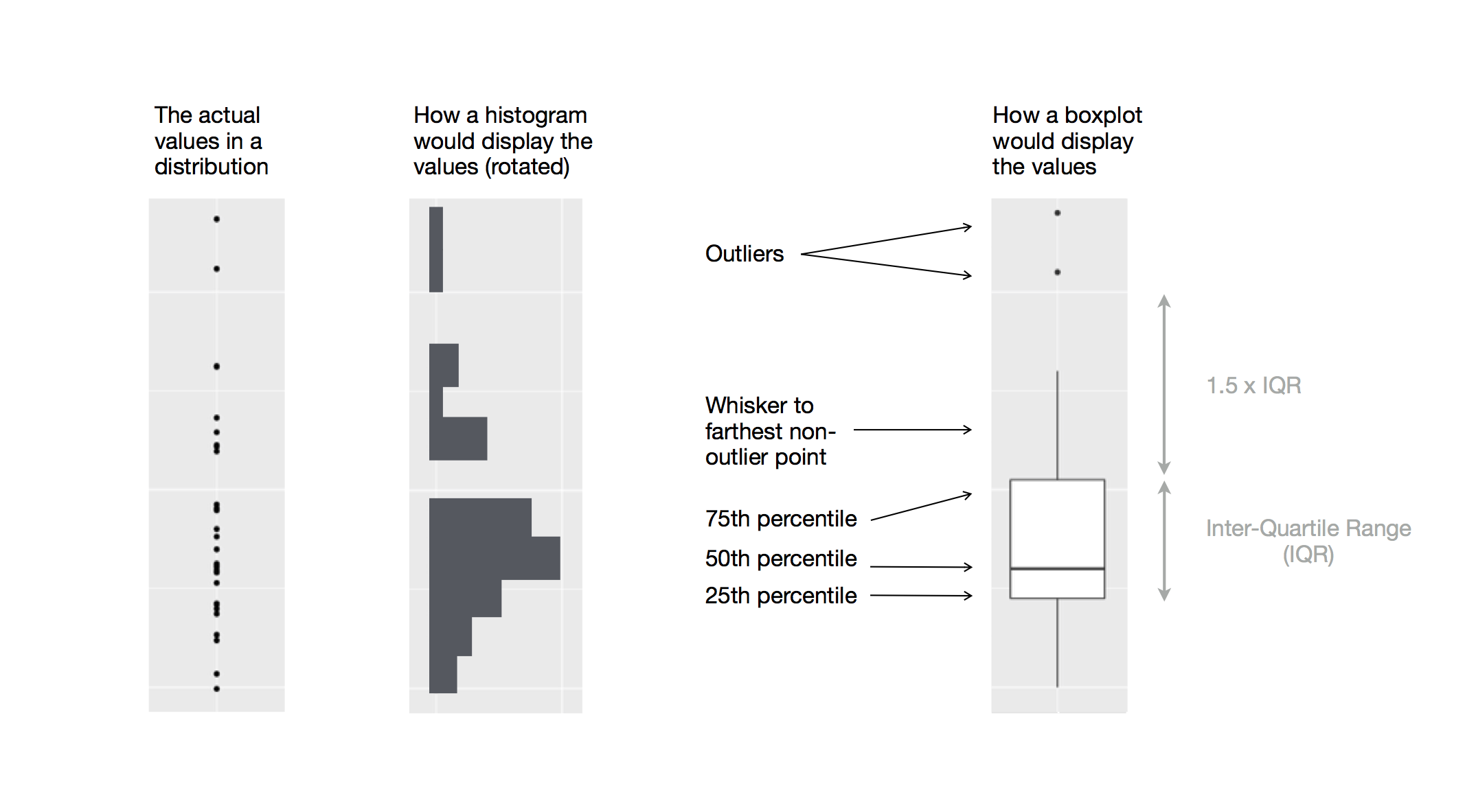
Boxplots
Boxplot are used to display visual shorthand for a distribution of a continuous variable broken down by categories.
They mark the distribution’s quartiles.
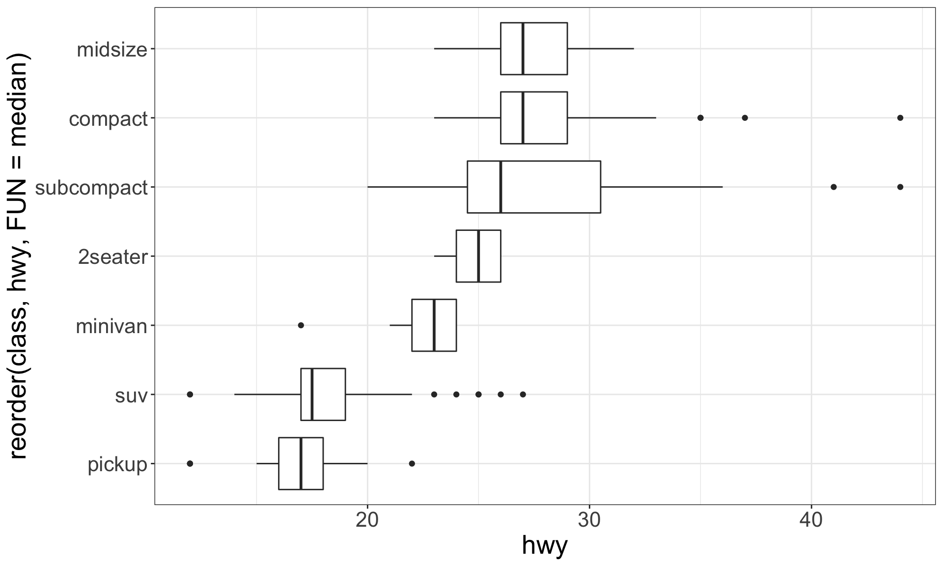
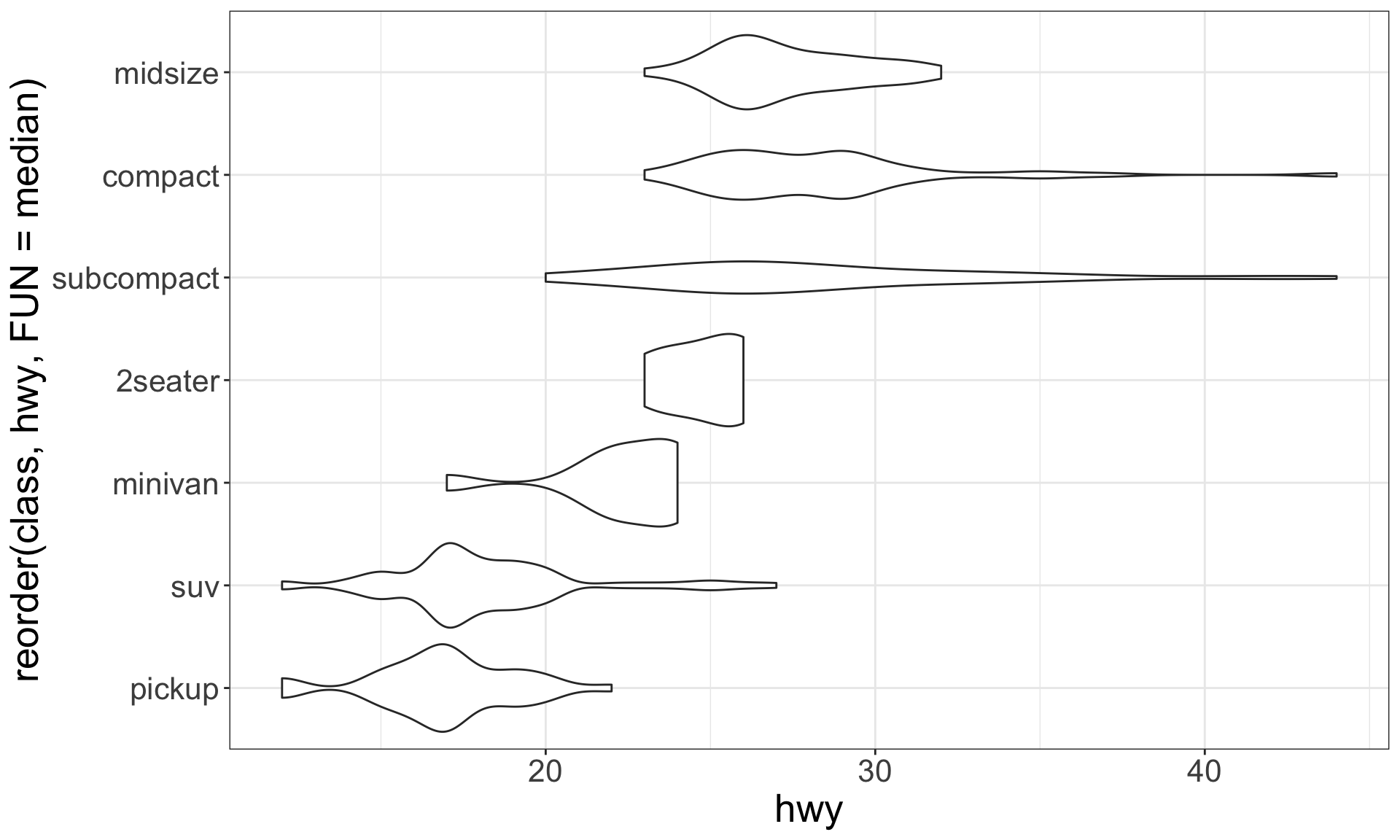
A categorical and a continuous variable
Use a boxplot or a violin plot to display the covariation between a categorical and a continuous variable.
Violin plots give more information, as they show the entrire estimated distribution.
ggplot(mpg, aes(
  x = reorder(class, hwy, FUN = median), y = hwy)) +
  geom_boxplot() + coord_flip()
ggplot(mpg, aes(
  x = reorder(class, hwy, FUN = median), y = hwy)) +
  geom_violin() + coord_flip()
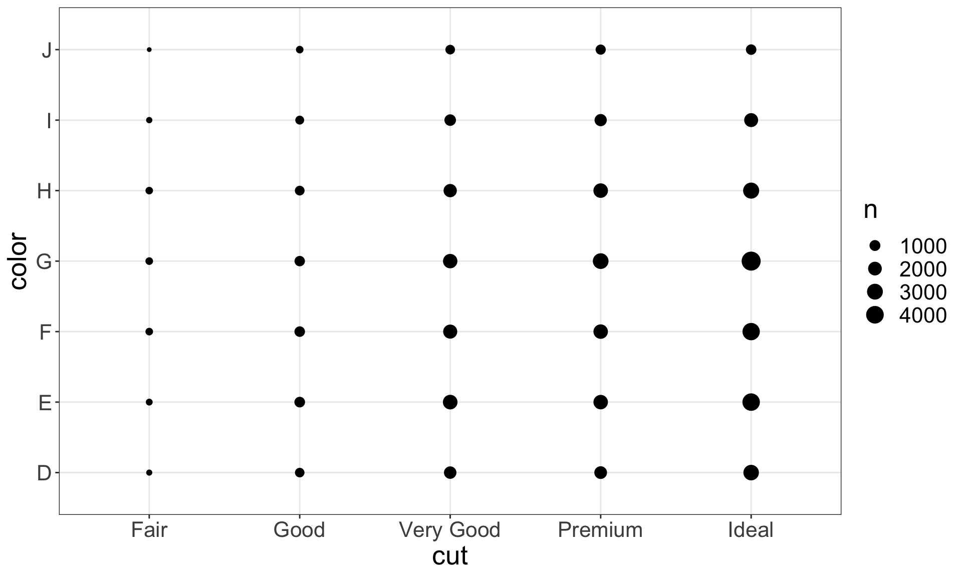
Two categorical variables
To visualise the covariation between categorical variables, you need to count the number of observations for each combination, e.g. using geom_count():
ggplot(data = diamonds) +
  geom_count(mapping = aes(x = cut, y = color))
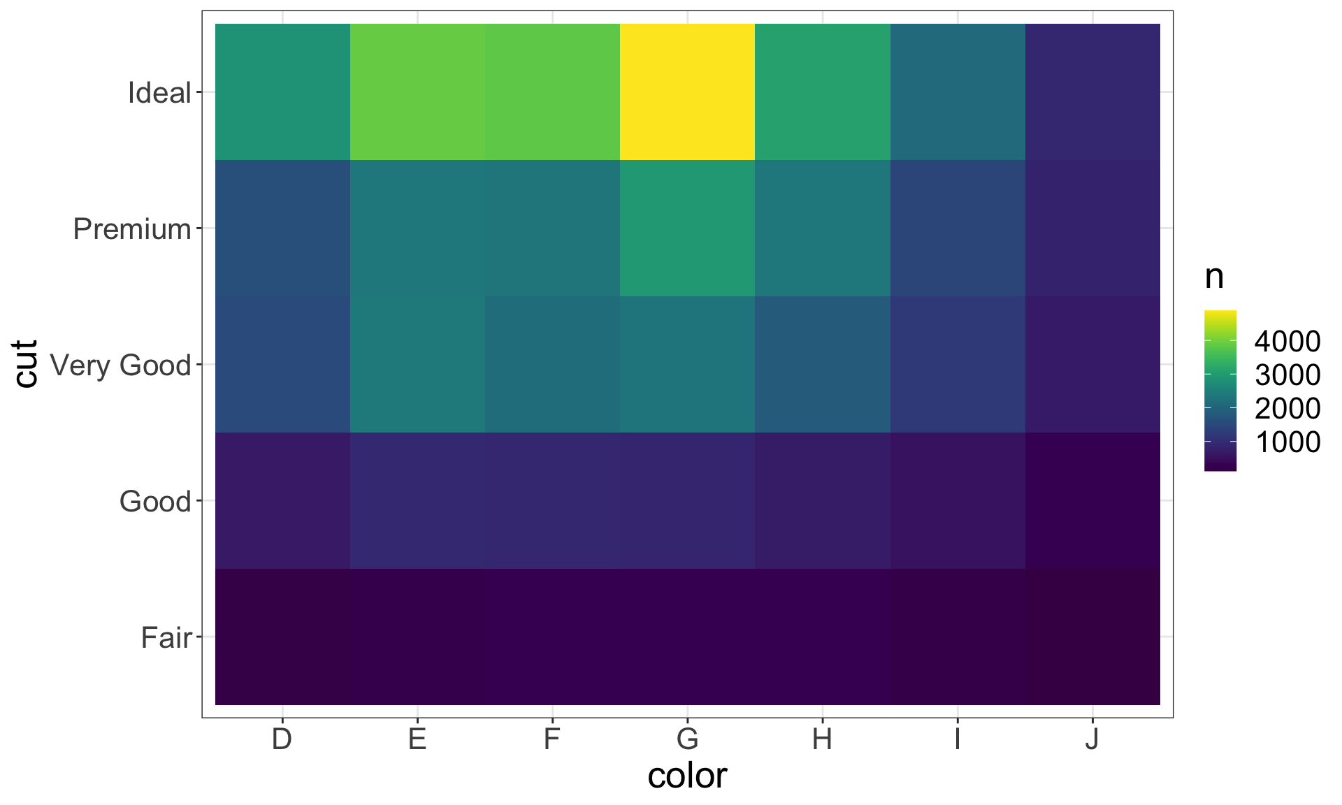
Another approach is to first, compute the count and then visualise it by coloring with geom_tile() and the fill aesthetic:
diamonds %>%
  count(color, cut) %>%
  ggplot(mapping = aes(x = color, y = cut)) +
    geom_tile(mapping = aes(fill = n)) +
  scale_fill_viridis()
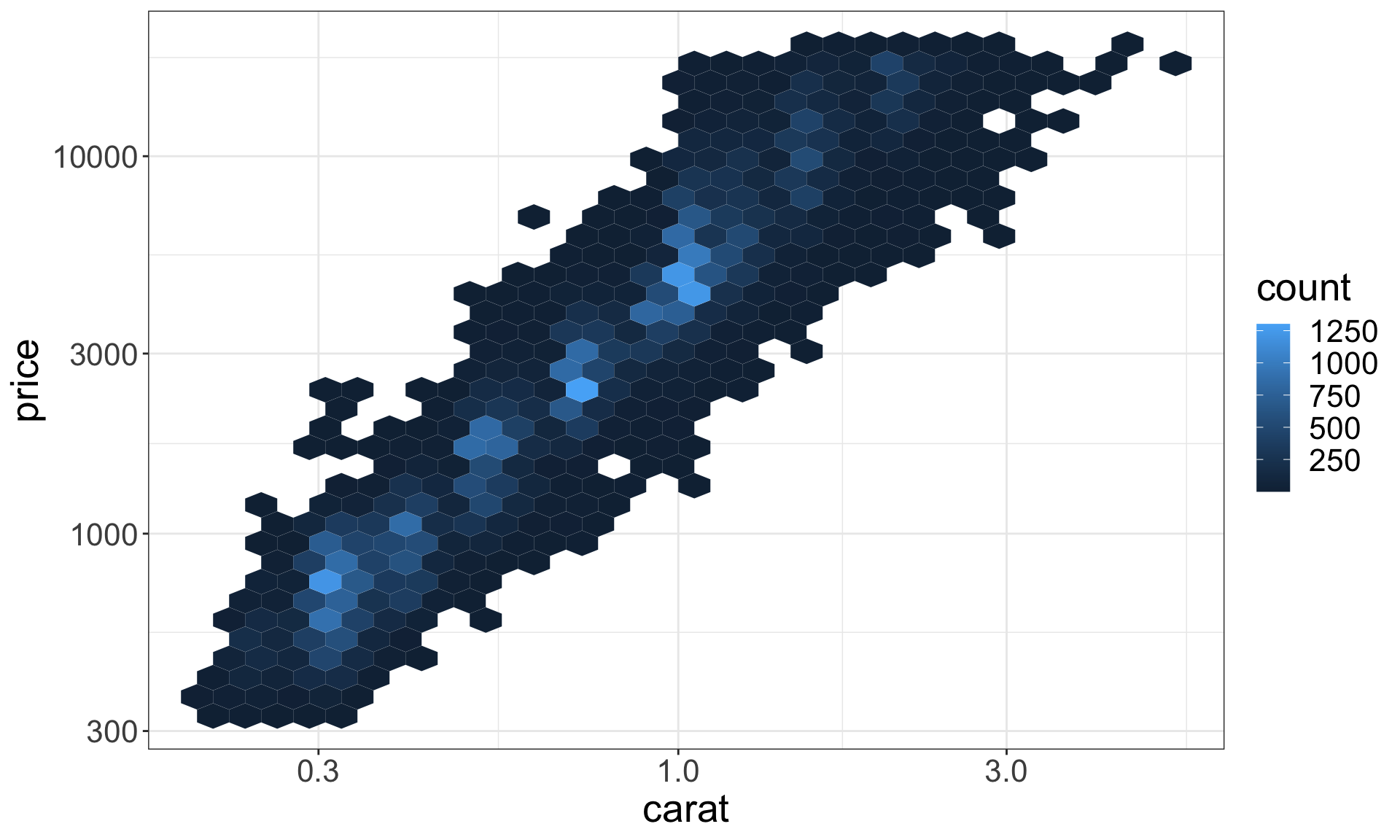
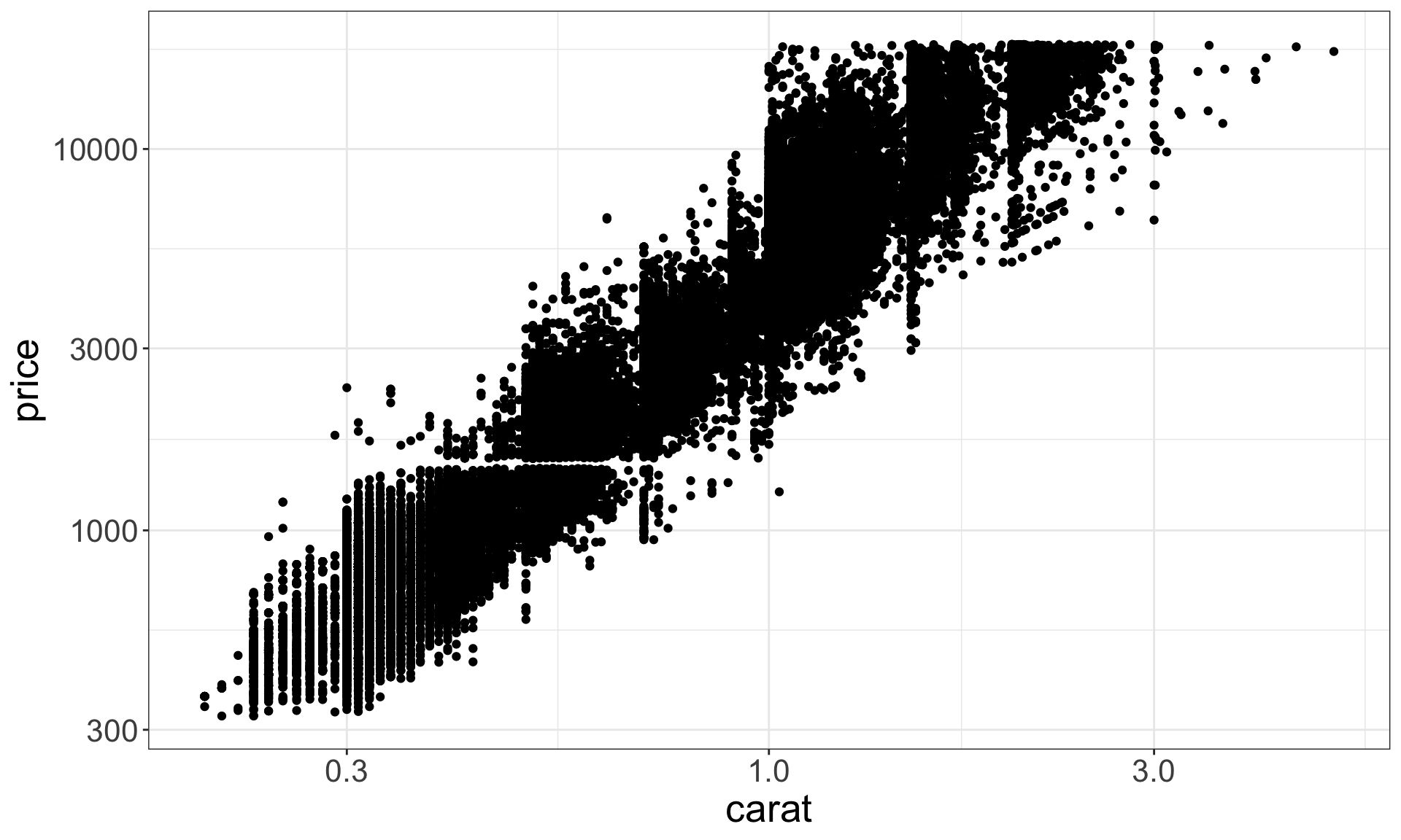
Two continuous variables
ggplot(data = diamonds) +
  geom_point(mapping = aes(x = carat, y = price)) +
  scale_y_log10() + scale_x_log10()
# install.packages("hexbin")
ggplot(data = diamonds) +
  geom_hex(mapping = aes(x = carat, y = price)) +
  scale_y_log10() + scale_x_log10()